Friday, 28 May 2010

Final Boards

Final 3 boards for the Ben & Jerrys brief.

Design in context

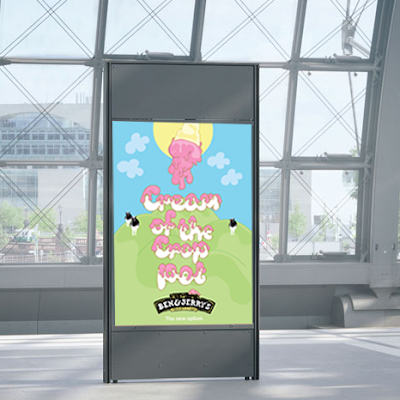
I have placed my Ben & Jerrys poster in appropriate contexts to give an idea of how it would look in different environments and to see if it would attract a lot of attention.
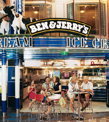
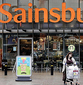
I think the bright colours on the poster really stand out and because its fun and playful it catchs peoples eyes.
Tuesday, 25 May 2010

Product shot

These are the best final product shots that I have taken showing all final outcomes together as a set. I think all the products are working really well together.

Poster design

Photographed poster, the colours are so vibrant after printing onto bulky newsprint, it has really enhanced my design.

Free Sample card

Final photographed sample card.

Icecream pot

Final photographed shot of new labelling for icecream pot.

Envelope

Final photographed envelope design-front and back.

Envelope photographed with letter head.