
 Shadowing...making type look more 3d.
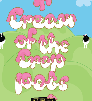
I decided to go for this composition with the type at the bottom of the page, I didn't want the type to contrast too much with the poster and other elements that are going on within it but i needed to get across that the 'Cream of the crop' option was NEW.
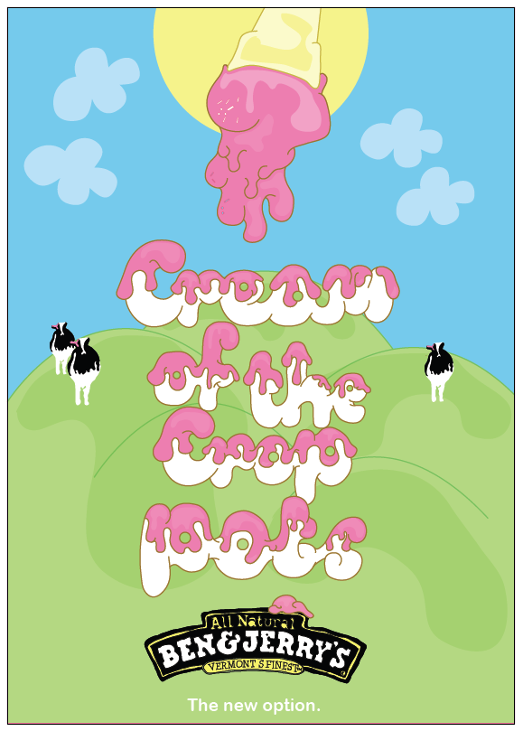 I refined the ice cream displayed at the top of my poster slightly, it looks more like the icecream is flowing now.
 New option is slightly too big, distracts attention away from art.
 I choose to work with arial rounded for the type in my poster as it is curvy and suiting to the style of the rest of my poster.
Add 'new' to the poster to emphasis the fact that there is a new range obviously called 'Cream of the crop pots'.


I thought that instead of having the slogan as 'Cream of the crop', i think it would be quite cool to change it to 'cream of the crop pot' as this has more reference to the Ben and Jerry's ice cream.
No comments:
Post a Comment