
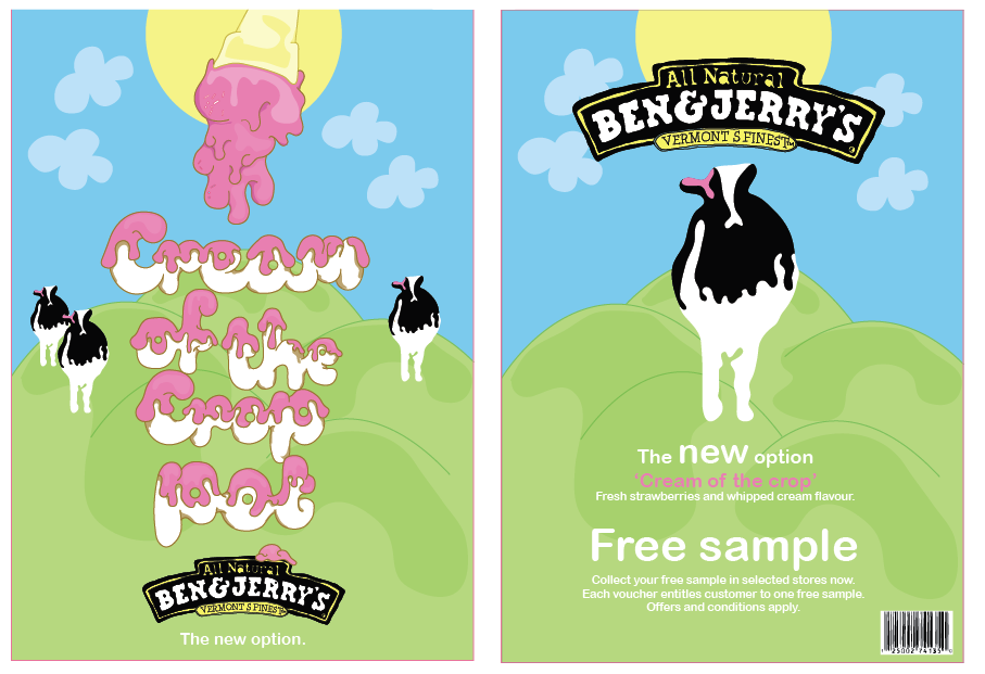
Below: This is close to how I would like my final composition to look like although I think I need to make add more shadowing to certain areas to make it all tie together. I also added a sun to the composition to add more colour and excitement to the poster and to tie in with existing style.

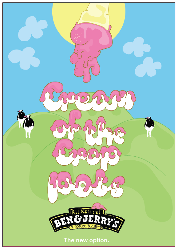
Below: This layout is starting to work really well although I think I need to add alot more shading to the poster to make it look slightly 3d and to make areas stand out over others.

Close up of typography, I added shadowing of the type to make it look more 3d .

Below: Variety of different layouts, adding different elements of my illustrations to add interest and excitment to my design.


Layout/ composition variation, more simple approach.

Below I have experimented with different compositions using the different illustrations that I have drawn. Although I think this design looks cool i think there is too much happening and it distracts attention away from the type and meaning.

Compositons that could work well with the imagery and typography that I am using. Trying to keep within exisiting style of Ben and Jerrys.
Little sketch to show how I could work imagery around my typography.
Initial sketching of typography. Aim to make it really bubbly and able to be transformed to look 3d.
Different variations of how I could communicate 'Cream of the Crop', I think that 'Cream of the Crop Pots' works really well.
'Cream of the crop' i am suggesting is a new flavour that ben &jerrys are bringing out.
Cream of the crop will be Strawberrys and cream flavour...


 Having all information at the top of the letter head is a bit too much and looks over crowded slightly.
 This one i can see is working the best out of them all.

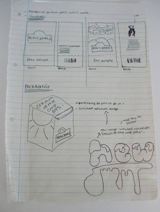
 Below: new packaging (side of icecream pot) Adding flavour, branding and 'New' so that people are more intrigued to buy it.
 Below: Design ideas and shelf hanger to be displayed on shelving where Ben and Jerrys is being sold.

 Bringing design onto existing packaging.

 Shadowing...making type look more 3d.
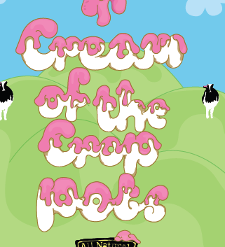
 I refined the ice cream displayed at the top of my poster slightly, it looks more like the icecream is flowing now.
 New option is slightly too big, distracts attention away from art.
 I choose to work with arial rounded for the type in my poster as it is curvy and suiting to the style of the rest of my poster.


 The ice cream cone that sits at the top of my poster i think needs to be re adjusted, i think i need to add more colour and shadowing to make it not look like such a big block of colour.
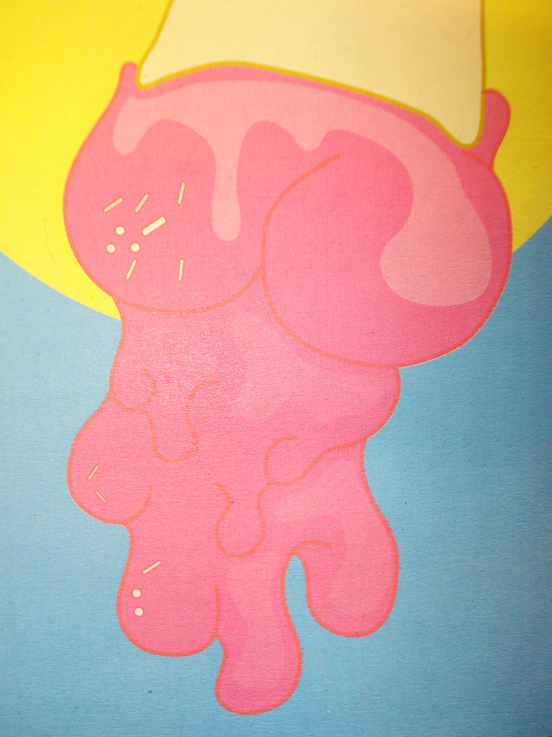 I am really pleased with how the type turned out, from initial sketches to the production of adding colour in illustrator.
 Below: This is close to how I would like my final composition to look like although I think I need to make add more shadowing to certain areas to make it all tie together. I also added a sun to the composition to add more colour and excitement to the poster and to tie in with existing style.
 Below: This layout is starting to work really well although I think I need to add alot more shading to the poster to make it look slightly 3d and to make areas stand out over others.


 Below I have experimented with different compositions using the different illustrations that I have drawn. Although I think this design looks cool i think there is too much happening and it distracts attention away from the type and meaning.


