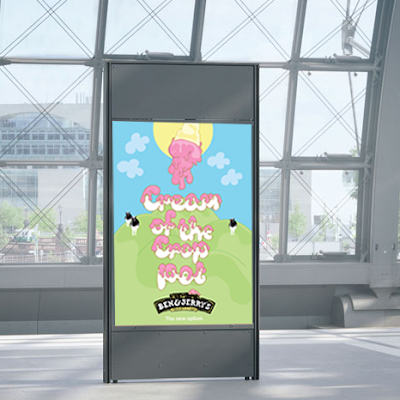
I have placed my Ben & Jerrys poster in appropriate contexts to give an idea of how it would look in different environments and to see if it would attract a lot of attention.

I think the bright colours on the poster really stand out and because its fun and playful it catchs peoples eyes.


No comments:
Post a Comment