When printing onto this stock the cream colour of the stock showed through on the 'cream of the crop' type making it more appropriate and enhancing the meaning of the quote but using this stock made all the colours that I selected look alot duller on this particular paper compared to what it looked like on screen.

 The ice cream cone that sits at the top of my poster i think needs to be re adjusted, i think i need to add more colour and shadowing to make it not look like such a big block of colour.
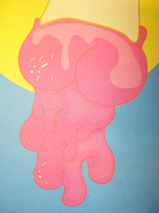 I am really pleased with how the type turned out, from initial sketches to the production of adding colour in illustrator.
No comments:
Post a Comment