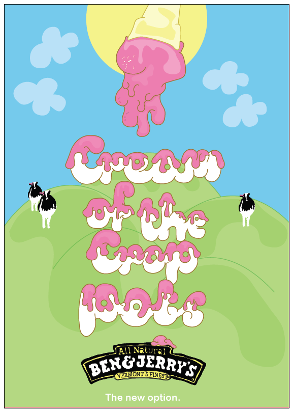
Below: This is close to how I would like my final composition to look like although I think I need to make add more shadowing to certain areas to make it all tie together. I also added a sun to the composition to add more colour and excitement to the poster and to tie in with existing style.

Below: This layout is starting to work really well although I think I need to add alot more shading to the poster to make it look slightly 3d and to make areas stand out over others.

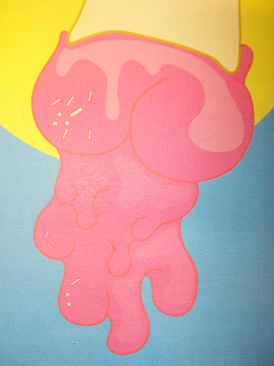
Close up of typography, I added shadowing of the type to make it look more 3d .

Below: Variety of different layouts, adding different elements of my illustrations to add interest and excitment to my design.


Layout/ composition variation, more simple approach.

Below I have experimented with different compositions using the different illustrations that I have drawn. Although I think this design looks cool i think there is too much happening and it distracts attention away from the type and meaning.

Compositons that could work well with the imagery and typography that I am using. Trying to keep within exisiting style of Ben and Jerrys.
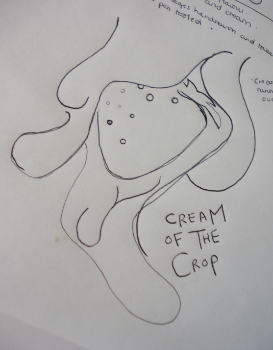
Little sketch to show how I could work imagery around my typography.
Initial sketching of typography. Aim to make it really bubbly and able to be transformed to look 3d.
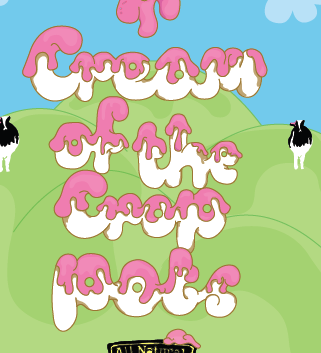
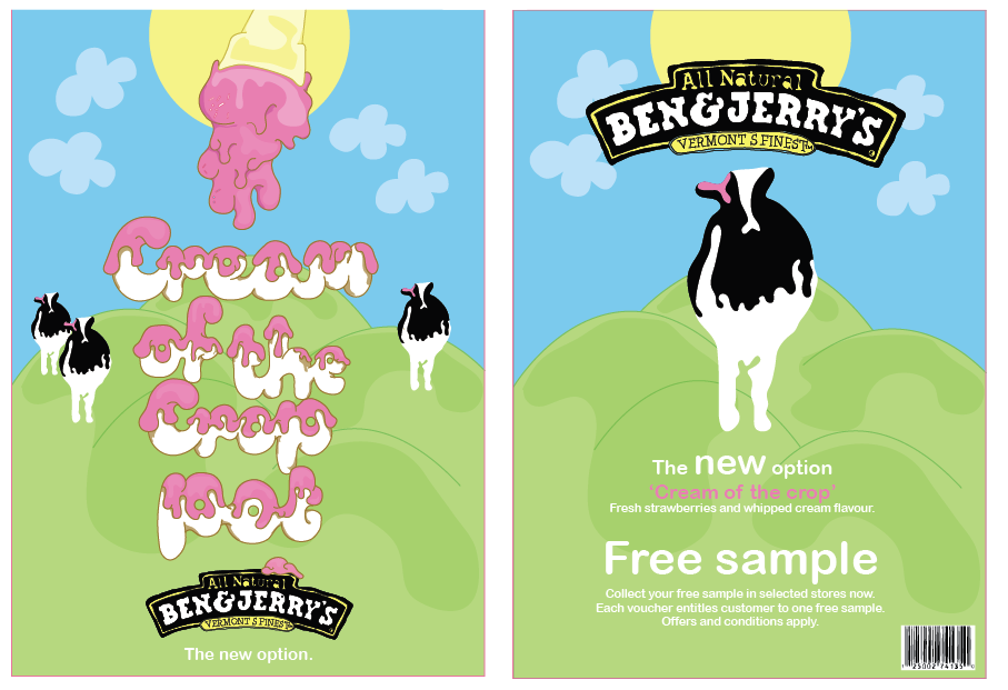
Different variations of how I could communicate 'Cream of the Crop', I think that 'Cream of the Crop Pots' works really well.
'Cream of the crop' i am suggesting is a new flavour that ben &jerrys are bringing out.
Cream of the crop will be Strawberrys and cream flavour...
 Below: new packaging (side of icecream pot) Adding flavour, branding and 'New' so that people are more intrigued to buy it.
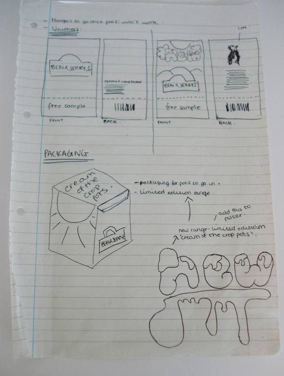
 Below: Design ideas and shelf hanger to be displayed on shelving where Ben and Jerrys is being sold.

 Bringing design onto existing packaging.